


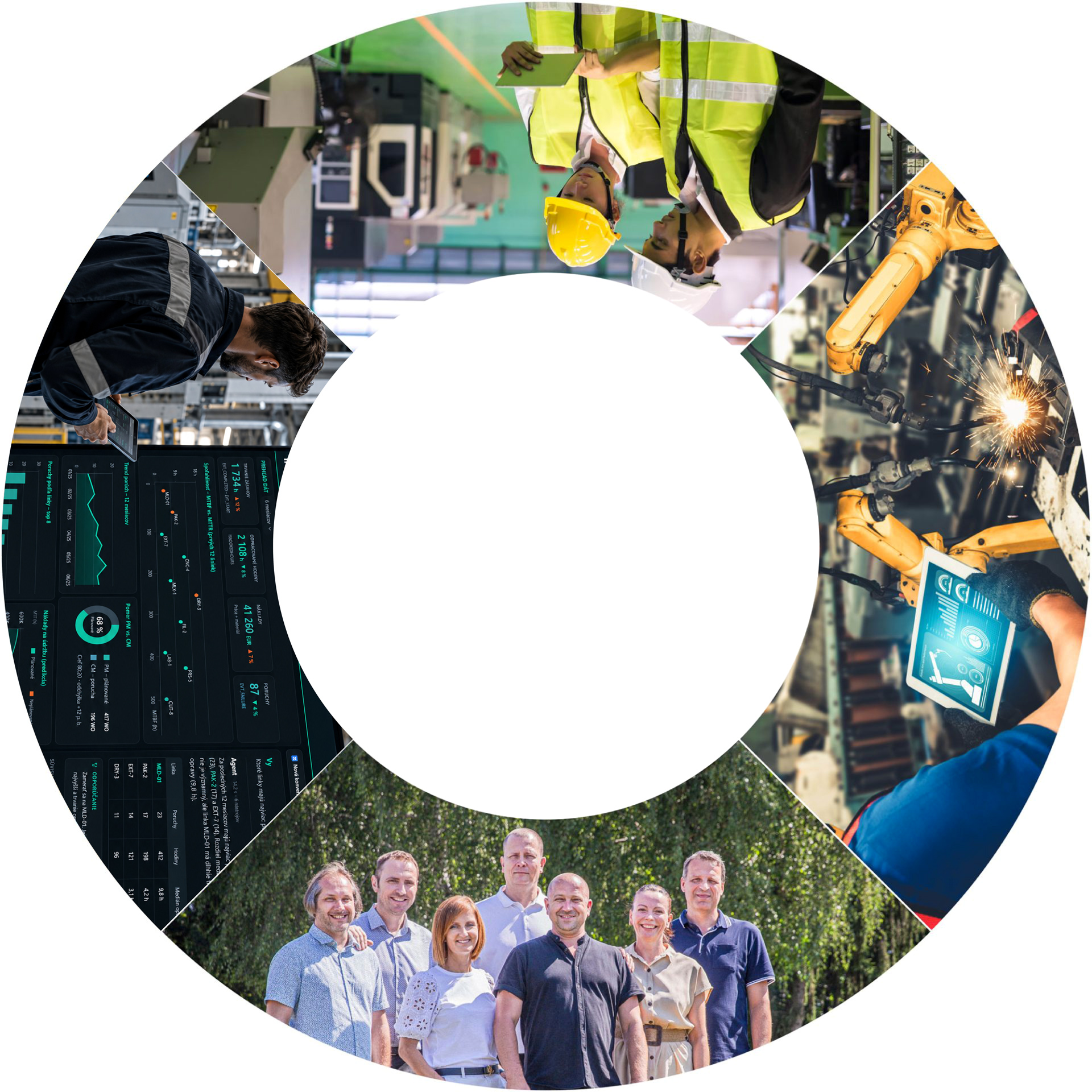
Specialists in INDUSTRY 4.0
You can rely on us for digital factory management and development. We'll pave the way to higher productivity, a successful future and a happy customer.
Is your production working efficiently?
OEE, or overall equipment effectiveness, is a key KPI for evaluating production efficiency. Do you know what the OEE value is in your production?
Digitise maintenance processes
Get a perfect overview of your maintenance. By implementing our Hexagon EAM and IWI solutions, you get a transparent picture of costs, response rates, utilization and other maintenance KPIs.
Do you have the logistics under control?
Together, digital and properly configured logistics will move us forward, optimise processes and ensure that all your operations run smoothly and efficiently.
Get the most out of your data
An AI agent allows you to easily query data from your EAM system and obtain specific answers, overviews, or insights. Do you know what your data can tell you?
We build lasting partnerships based on reliable adherence to deadlines and agreed terms.
+
0
skilled workers
+
0
%
satisfied clients
+
0
years on the market
#pripadove-studie-container{
display: block;
}
#pripadove-studie-container-mobile{
display: none;
}
.container-wrapper {
display: flex;
flex-direction: row;
}
.container-flex {
align-items: center;
color: transparent;
width: 60%;
aspect-ratio: 20/10.7;
display: flex;
gap: 1vw;
}
.container-content {
position: relative;
width: 40%;
display: flex;
align-items: center;
}
.ps-content-wrapper.active {
position: absolute;
opacity: 1;
width: 100%;
}
.ps-content-wrapper {
position: absolute;
opacity: 0;
width: 100%;
padding-right: 20px;
}
.ps-content-title{
font-size: var(--e-global-typography-a30762e-font-size);
font-weight: var(--e-global-typography-a30762e-font-weight);
color: var(--e-global-color-743d68e);
font-family: var(--e-global-typography-a30762e-font-family), Sans-serif;
line-height: 1.2;
margin-bottom: 20px;
}
.ps-content-text{
color: var(--e-global-color-743d68e);
font-family: var(--e-global-typography-22d77b8-font-family), Sans-serif;
font-size: var(--e-global-typography-22d77b8-font-size);
font-weight: var(--e-global-typography-22d77b8-font-weight);
line-height: var(--e-global-typography-22d77b8-line-height);
margin-bottom: 20px;
}
.box-flex {
background-repeat: no-repeat;
background-size: cover;
background-position: center;
border-radius: 50px;
cursor: pointer;
transition: all 0.7s ease-in-out;
position: relative;
height: 100%;
width: 15%;
display: flex;
align-items: center;
justify-content: center;
}
.box-flex::before{
content: "";
position: absolute;
top: 0;
left: 0;
height: 100%;
width: 100%;
background: linear-gradient(342deg, rgba(42,57,53,1) 0%, rgba(61,76,72,1) 100%);
transition: all 0.7s ease-in-out;
border-radius: 10px;
z-index: 0;
}
.active {
color: white;
width: 60%;
transition: all 0.7s ease-in-out;
}
.active > .flex-inner {
width: 80%;
height: 80%;
transition: all 0.7s ease-in-out;
border-radius: 50%;
}
.active > .flex-inner-text:hover {
background: unset !important;
}
.active > .flex-inner-text {
background: unset;
transition: all 0.7s ease-in-out;
}
.active > .flex-inner-text > .flex-text {
opacity: 0;
transition: all 0.7s ease-in-out;
}
.flex-inner {
position: relative;
width: 100%;
height: 100%;
border-radius: 10px;
transition: all 0.7s ease-in-out;
}
.flex-inner-text {
position: absolute;
width: 100%;
height: 100%;
background: linear-gradient(180deg, rgba(42,57,53,0) 40%, rgba(51,66,62,1) 90%, rgba(61,76,72,1) 100%);
border-radius: 10px;
transition: all 0.7s ease-in-out;
overflow: hidden;
}
.flex-inner-text:hover {
background: linear-gradient(180deg, rgba(42,57,53,0) 0%, rgba(51,66,62,1) 90%, rgba(61,76,72,1) 100%);
transition: all 0.7s ease-in-out;
}
.flex-text {
transition: all 0.7s ease-in-out;
font-family: "segoe UI", Sans-serif;
font-size: 32px;
font-weight: bold;
opacity: 1;
color: white;
white-space: nowrap;
width: 100%;
height: 100%;
position: relative;
transform: rotate(270deg);
transform-origin: top left;
left: 25%;
top: calc(100% - 20px);
}
#flex-box-1, #flex-box-2, #flex-box-3, #flex-box-4 {
background-size: cover;
background-position: center;
}
@media screen and (max-width: 1024px) {
#pripadove-studie-container{
display: none;
}
#pripadove-studie-container-mobile{
display: block;
}
.in-button {
display: flex;
gap: 10px;
margin-top: 20px;
}
.container-wrapper {
display: flex;
flex-direction: column-reverse;
}
.container-content {
position: relative;
width: 100%;
height: auto;
display: flex;
align-items: center;
}
.ps-content-wrapper.active {
position: relative;
opacity: 1;
width: 100%;
height: auto !important;
max-height: 500px;
transition: all 0.7s ease;
margin-top: 20px;
margin-bottom: 30px;
}
.ps-content-wrapper {
position: relative;
opacity: 0;
width: 100%;
max-height: 0px;
margin-top: 0px;
padding-right: 0px;
transition: all 0.7s ease;
}
.box-flex.active {
color: white;
width: 90vw;
height: 90vw !important;
transition: all 0.7s ease;
}
.box-flex {
height: 15vw;
width: 90vw;
}
.container-flex {
align-items: center;
color: transparent;
width: 100%;
height: auto;
aspect-ratio: unset;
flex-direction: column;
gap: 10px;
}
.flex-items-desc.active-item {
opacity: 1;
transition: all 0.7s ease-in;
position: relative;
}
.flex-text {
transition: all 0.7s ease;
font-family: "segoe UI", Sans-serif;
font-size: 32px;
font-weight: bold;
opacity: 1;
color: white;
width: 100%;
height: 100%;
position: relative;
transform: rotate(0deg);
transform-origin: top left;
left: 5%;
top: 40%;
}
}
@media screen and (max-width: 767px) {
.flex-text {
top: 10%;
}
.active {
color: white;
width: 100%;
height: 90vw !important;
transition: all 0.7s ease;
}
.box-flex {
height: 15vw;
width: 90vw !important;
}
}
Satisfied clients














Said about us
.lazy-block-featured-wrapper {
display: flex;
}
.lazy-block-featured-container {
display: flex;
flex-direction: column;
width: 30%;
flex-grow: 1;
color: var(--e-global-color-primary);
font-family: var(--e-global-typography-34d9f5f-font-family), Sans-serif;
font-size: var(--e-global-typography-34d9f5f-font-size);
font-weight: var(--e-global-typography-34d9f5f-font-weight);
line-height: var(--e-global-typography-34d9f5f-line-height);
transition: all .3s ease;
padding: 30px;
position: relative;
}
.lazy-block-featured-container::before {
background-image: url('https://inseko.sk/wp-content/uploads/2024/09/uvodzovky.png');
content: "";
background-size: 100%;
background-repeat: no-repeat;
position: absolute;
width: 70px;
height: 70px;
right: 0px;
top: 0;
}
.lazy-block-featured-container:hover::before {
background-image: url('https://inseko.sk/wp-content/uploads/2024/09/uvodzovky_aft.png');
content: "";
background-size: 100%;
background-repeat: no-repeat;
position: absolute;
width: 70px;
height: 70px;
right: 0px;
top: 0;
}
.lazy-block-featured-container::after {
background-image: url('https://inseko.sk/wp-content/uploads/2024/06/arrow_light.svg');
content: "";
background-size: 100%;
background-repeat: no-repeat;
position: relative;
width: 50px;
height: 50px;
left: calc(100% - 20px);
bottom: calc(0% - 30px);
margin-top: auto;
}
.lazy-block-featured-container:nth-child(1){
background-color: #CAFFF2;
}
.lazy-block-featured-container:nth-child(2){
background-color: #EDFBFB;
}
.lazy-block-featured-container:nth-child(3){
background-color: #CAFFF2;
}
.lazy-block-featured-container:nth-child(4){
background-color: #EDFBFB;
}
.lazy-block-featured-container:hover {
background-color: #333333;
color: white;
transition: all .3s ease;
}
.lazy-block-featured-container .image {
width: 100px;
height: 100px;
object-fit: contain;
position: relative;
}
.lazy-block-featured-container .meno {
font-weight: 600;
font-size: 1.2em;
padding-bottom: 10px;
padding-top: 10px;
}
.lazy-block-featured-container .funkcia {
font-weight: 600;
padding-bottom: 10px;
}
.lazy-block-featured-container .citat {
display: -webkit-box;
-webkit-line-clamp: 4; /* Počet riadkov */
-webkit-box-orient: vertical;
overflow: hidden;
text-overflow: ellipsis;
margin-bottom: 20px;
}
@media only screen and (max-width: 1366px) {
.lazy-block-featured-wrapper {
display: flex;
flex-wrap: wrap;
}
.lazy-block-featured-container {
width: 50%;
}
}
@media only screen and (max-width: 1024px) {
.lazy-block-featured-container {
width: 100%;
}
}
News
Loading...
Cookies
Copyright © Inseko 1991 – 2026
ADDRESS
INSEKO a.s.
Bytčická 2
Žilina 010 01
IČO: 00615854
IČ DPH: SK2020445152
CONTACT
Sales Department
+421 903 264 367 inseko@inseko.sk
Contact us today
This site is protected by reCAPTCHA and is subject to Google's Privacy Policy and Terms of Service.

IT innovation with future